You are here: CLASSE Wiki>HEP/SWIG Web>AnalyisEnvironment>AEExampleDataPresentations>AEExampleComparingDistributions (30 Aug 2006, ChrisDJones)Edit Attach
Data Presentation Example: Comparing Distributions
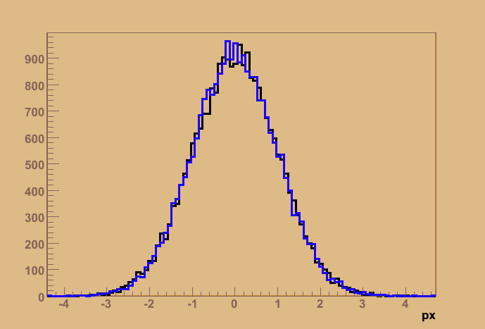
Histograms are a standard way of looking at a data distribution. Often, one needs to compare data distributions (E.g., in HEP one often compares distributions obtained from simulated signal to those obtained from simulated background). The standard way to do this is to directly overlay the two histograms onto one plot- simple histogram overlay:

- thickened the lines used to draw the data to better emphasize the data
- changed the color of the axes in order to de-emphasize them relative to the data
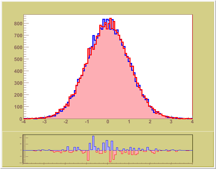
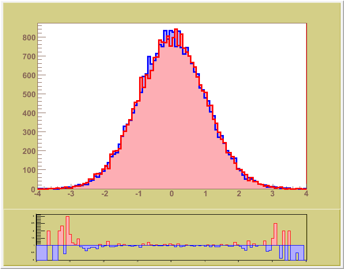
histogram_1 - histogram_2) or the ratio
- overlay with difference:

- overlay with ratio:

- The top histograms are now filled in with a 'softer' version of the color used to draw that histogram (this avoids 'tiring' the eyes when an image has large areas of highly saturated color). The fill color is meant to better emphasize which distribution is larger for a particular bin. The outline of the histogram is drawn on top of the fill color so that both distributions can be seen at all times. (This required drawing 4 histograms, 2 that were filled and 2 that were just outlines)
- The bottom histograms use the same color coding as the top ones to reinforce the link between them
- The top histograms are the 'primary' data so their background color has a higher contrast with the forground color in order to draw your attention
- Label the bottom box to say what is being shown
- Try using partial-transparency for the fill color to allow the 'distribution behind' to be seen through the other one (rather than doing a two-phase rendering)
- Have the top and bottom plot share the same X axis (I could not figure out how to do that with the tool I was using)
- Add error bars to the lower distributions to show the significance of the difference
- Try a comparision plot which is a ratio of the error on the difference to the difference. Such a plot should show the significance of the differences between the distributions
- The Y axis of the ratio plot should be done logarithmically so that
a/bandb/aappear to have the same displacement
Edit | Attach | Print version | History: r4 < r3 < r2 < r1 | Backlinks | View wiki text | Edit wiki text | More topic actions
Topic revision: r4 - 30 Aug 2006, ChrisDJones
 Copyright © by the contributing authors. All material on this collaboration platform is the property of the contributing authors.
 Ideas, requests, problems regarding CLASSE Wiki? Send feedback
